Device Detection
Device detection can be used to detect visitor’s device: desktop, tablet or phone. Tablet and phone devices are also called mobile devices.
Button Devices below code editor opens tabs for device detection settings.
If you would like to insert ads for all devices then you don’t need to use this function. Use it only if you would like to insert ads or codes only for specific devices (desktop, tablet, phone).
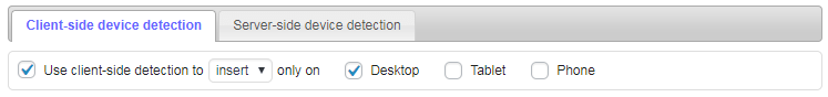
There are two types of device detection: server side and client-side and client-side type has two actions: show and insert.
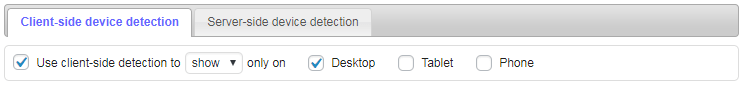
Client-side detection
Client-side detection of mobile/desktop devices works always as it is done in visitor’s browser. CSS media queries and viewport (browser’s screen) width are used to show / hide or insert Ad Inserter code blocks. You can define devices (name and minimum screen width) as Viewports in plugin settings (tab ⚙ / tab Viewports).
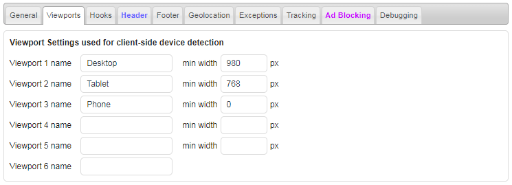
Up to 6 viewport names and widths can be defined. Default values are:
- Desktop: 980 pixels or more
- Tablet: from 768 pixels to 979 pixels
- Phone: less than 768 pixels
Client-side detection has two actions: show and insert:
Both actions use viewports and CSS media queries to detect screen size:
- Show: Shows code blocks for enabled devices, for other devices code blocks remain hidden
- Insert: Inserts code blocks for enabled devices using Javascript code when the page is loaded
In most cases you should use ONLY client-side detection type. Works perfectly with responsive designs as they use CSS media queries. Of course, when using Insert action the code will be inserted only when the page is loaded so when you resize the page the code blocks will not change – you need to reload the page to re-insert code blocks for new viewport.
Some ad networks (like AdSense) do not allow to hide ads. When using Show action the ads are still inserted (loaded and counted) for all devices, but for unwanted devices they are hidden by the browser using CSS media queries based on viewport widths. In such case you should use Insert action so the ads will be inserted only on wanted devices.
AMP pages are normally displayed only on mobile devices so in most cases client-side device detection is not needed. Ad Inserter will try to insert custom CSS code for media queries needed for device detection so client-side method show should work also on AMP pages. However, client-side method insert can’t be used as Javascript code is not allowed on AMP pages.
To prevent layout shift when using client-side device detection you need to define block height to reserve the space for the block.
It makes no sense to enable device detection and then select all devices. In such case simply don’t enable device detection – the block will be inserted for all devices.
Viewport separators
You can also have different codes for different viewports inside one block. Separate the codes with [ADINSERTER VIEWPORT] separator. For example:
[ADINSERTER VIEWPORT="Desktop"]
Desktop ad code

[ADINSERTER VIEWPORT="Phone"]
Phone ad code
Use the same names for viewports as they are defined on the Viewports tab (general plugin settings, tab  ). You can list more than one viewport name for each separator.
If you put code above the first VIEWPORT separator it will be inserted for all viewports.
You can use the ^ characted in front of the viewport name to invert viewport, for example:
[ADINSERTER VIEWPORT="Desktop"]
Desktop ad code

[ADINSERTER VIEWPORT="^Desktop"]
Ad code for all viewports except Desktop
The code for each viewport will be inserted according to the setting for Dynamic blocks. When Client-side insert mode is selected, the code will be inserted with Javascript code and shown/hidden with CSS for other settings. You can change insertion method (show or insert) with code="method" attribute. For example, this code uses Client-side insert mode for Desktop viewport:
[ADINSERTER VIEWPORT="Desktop" code="insert"]
Desktop ad code

[ADINSERTER VIEWPORT="Phone"]
Phone ad code
You can also add individual css code to each viewport:
[ADINSERTER VIEWPORT="Desktop" css="height: 250px;"]
Desktop ad code

[ADINSERTER VIEWPORT="Phone" css="height: 300px;"]
Phone ad code
The css code of the current viewport will be added to the block style.
PRO Ad Inserter Pro supports also viewport separators inside list check options inside a single block. Please check shortcode processing order for details.
Server-side detection
Server-side detection of mobile/desktop devices works only when Ad Inserter plugin is called. It is called by WordPress when it needs to generate a page. However, when you are using caching, it saves created page for quicker serving. In such cases the user might get (saved) page for wrong device (used by some previous visitor who triggered page caching). To solve this issue use themes that generate separate pages for desktop and mobile devices or use mobile theme switcher plugin (for example Any Mobile Theme Switcher).
Server-side detection uses User-Agent string combined with specific HTTP headers to detect the environment.
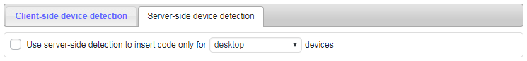
Available choices:
- Desktop devices
- Mobile devices (tablets and phones)
- Tablet devices
- Phone devices
- Desktop and tablet devices
- Desktop and phone devices
Use server-side device type detection only when you need to insert (display and count) ONLY code blocks for specific device type. In all other cases switch it off.
If you are using No Wrapping style and need to hide code on some devices using client-side detection (CSS Media Queries) then you need to add appropriate class to your CSS code (ai-viewport-1, ai-viewport-2, ai-viewport-3). This doesn’t apply to widgets as they always contain a wrapping div.
Related Pages
Install Ad Inserter for free
Ad Inserter Pro Affiliate Program

Increase ad revenue with Ezoic
