How to minimize layout shift
A layout shift occurs when a visible element on your page changes position or size, affecting the position of content around it. Sometimes the shift is intended, such as when a container expands as a result of a user action. However, the dynamic nature of ads in combination with client-side functions can lead to unexpected layout shifts, which have a negative effect on the user experience and can cause serious usability problems.
The Cumulative Layout Shift (CLS) metric helps you address this problem by measuring how often it’s occurring for real users. CLS measures the sum total of all individual layout shift scores for every unexpected layout shift that occurs during the entire lifespan of the page.
Unexpected movement of page content usually happens because ad blocks (or any other codes inserted) don’t have server-side defined height, they are loaded asynchronously or DOM elements get dynamically added to the page above or between the existing content. The culprit might be an ad with unknown dimensions (created by responsive code) or a client-side function that inserts ad code after the page is loaded.
To prevent layout shift when the block is loaded, you need to define block height. This will reserve the space for the ad block so the layout will not shift when the ad will be loaded. You can define block height on the block Display settings (button Misc / tab Display). Of course, this assumes the ad will not be higher than the reserved ad block space. The example below sets block height to 250px:
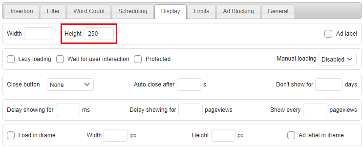
and adds height: 250px; code to the CSS code of the wrapping div. When Default alignment is used the following CSS code will be used:
margin: 8px 0; clear: both; height: 250px;
Only for server-side insertions you can define height directly with custom CSS code.
Please note that the ad height is defined by the ad code. Code for responsive ads may set ad height depending on the available space. Some ad networks (like AdSense) may also serve smaller ads than the space available. Block height, as defined in Ad Inserter, is the height of the inserted block – the height of the wrapping div. This is the reserved space for the ad. The following can happen:
- If the ad height is the same as the height of the reserved space (block height), then there will be no layout shift.
- If the ad height is higher than the height of the reserved space (block height), then the layout may get shifted down to accomodate the ad.
- If the ad height is smaller than the height of the reserved space (block height), then you’ll get blank space below the ad, but the layout will not be shifted.
Some ad codes like AdSense responsive code may override the height of the parent containers. In suce cases the height of the block will be overwritten and will not apply. When you need to minimize layout shift, use ad codes for fixed ad sizes wherever possible.
Client-side device detection
When using client-side device detection CSS media queries and viewport widths are used to determine if the block will be visible or not. However, when using the Insert method, the block is not inserted until the page is loaded and the Javascript code for the client-side functions runs. When you define block height the space for the block will be reserved and empty (blank) space will be shown for wanted (enabled) devices until the ad is loaded and consequently no layout shift will occur. For unwanted (disabled) devices nothing will be shown or inserted.
VIEWPORT separators
Ad Inserter allows to separate different ad codes for different devices using a single block. For example:
[ADINSERTER VIEWPORT="Desktop"]
Desktop ad code

[ADINSERTER VIEWPORT="Phone"]
Phone ad code
In terms of layout shift this approach slightly differs in how the block space is reserved. With this approach each VIEWPORT device option generates a block with a wrapping div. When you define a block height, it will be applied to all device options (each having a wrapping div). Consequently, for a unwanted (disabled) device this will cause a blank space to be displayed, however, there will be no layout shift for any device.
You can also add individual css code to each viewport:
[ADINSERTER VIEWPORT="Desktop" css="height: 250px;"]
Desktop ad code

[ADINSERTER VIEWPORT="Phone" css="height: 300px;"]
Phone ad code
The css code of the current viewport will be added to the block style.
Insertion before/after HTML element
If you are using client-side insertion before/inside/after HTML element there will always be layout shift as the insertion is done after the page is loaded. To prevent layout shift use server-side insertion and define ad height as described above.
Install Ad Inserter for free
Ad Inserter Pro Affiliate Program
